RATINGS:
Graphics: 7
Gameplay: 6
Sound: 6
Overall: 6
Pros: Beautifully rendered atmospheric backgrounds | Simple yet intuitive interface | Easy-to-pick-up controls
Cons: Early combat a bit too easy and occasionally not gripping enough to make you want to carry on playing, feels like a traditional MMO grind
We lately had a glimpse at the point-and-click space MMO shooter "sequel" Dark Orbit Reloaded, a free-to-play browser title from Bigpoint. It is, in fact, not that much a sequel but rather an overhaul of the original game, ironing out a few features and issues which actually annoyed the DarkOrbit community. Heavily relying on their player’s feedback, the company revised the title to increase its general accessibility for new players and enhance the overall experience.
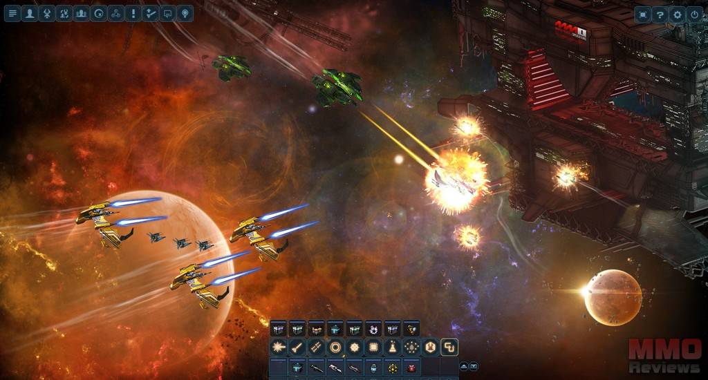
One of the major modifications concerned the UI, which we found quite straightforward to navigate during our testing. Additionally, it didn’t intrude too much on the screen as there weren’t half a dozen icons continuously flashing in order to induce players to purchase something at the shop; this is definitely something a lot of MMOs could take as an example. The UI appeared simple and sleek, still the further we looked into a specific menu, the more obvious it became how inherently intricate this MMO might be as you get more familiarised with the fundamental systems.
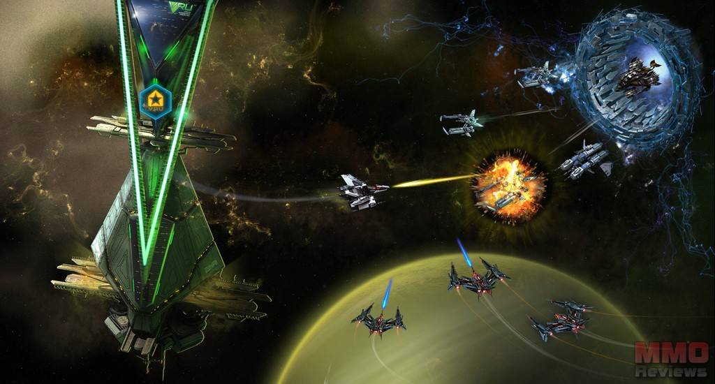
Besides the overhauled user interface, the game’s visuals also underwent a revamp, now presenting high-resolution browser graphics that truly do shine in the right places. In our video analysis, we already mentioned several times the beautiful looking space environments players navigate their ships through. They’re basically huge changing wallpapers with a few dynamic aspects like sudden lens flares from stars that appear from behind a planet; actually lovely details to bring a fairly static image to life. The only criticism we would like to put forward regarding the visuals is the somewhat incoherent style of the kind of pixely ships – of both player and enemy vehicles - in comparison to the rendered backdrops, which didn’t fit as well as it could do. We have to admit that the effects from explosions are in fact pretty well-done though.
Although only scratching the surface of the story, we truly felt as if we were right in the centre of something huge as we took our seat among the Mars Mining Operations that felt as if also being against the entire space, including rival factions as well as enemy intruders. During our first look into the game that merely lasted 30 minutes, we didn’t get involved too deep in this relationship, however we felt there was pretty much potential.
When it came to questing, this wasn’t quite as enjoyable as it could have been for the missions mostly consist of "go to location X to destroy an amount Y of enemy ships and come back to the base", only to then receive a somewhat similar task with the following mission that simply sent us a bit further into space. While the story was successful in compelling, the quests themselves were a little less gripping and didn’t give the impression of much action being involved as there were lots of particularly weak enemy ships. While this might be somewhat expected from a tutorial/ initial level in a MMO, it nevertheless felt fairly senseless to us.
Battles were particularly simple, made up of left clicking your chosen target, then punching in one of your hotkeys to activate a missile or laser. While lasers are weapons that have to be activated once to continue to automatically shoot until deactivated again, missiles have to be fired individually, which wasn’t initially apparent. We were therefore spamming the lasers thinking we had to push the button over and over, not realising that we were simply turning the auto fire on and off… The damage the enemy ships dealt was minimal and at no point did they seem to be a real threat, even when being surrounded by half a dozen of them. While absolutely in favour of tutorials being easier to some extent, we still welcome having a little challenge right from the start.
There seem to be loads of available features for customisation and upgrades; we got a foretaste of the crafting system when refining the ore we’d collected throughout our travels or looted from smashed foes, converting it into useful items to enhance our weapons. The system is elaborated very well and comprehensive enough to maintain more competitive and hardcore gamers busy and interested in their game. While being fundamental to play and fairly casual in nature, DarkOrbit Reloaded isn’t the sort of game in which players progress without investing time and effort; so should it be.


Deja tu comentario
You must be logged in to post a comment.